
Pastel Colours AI images
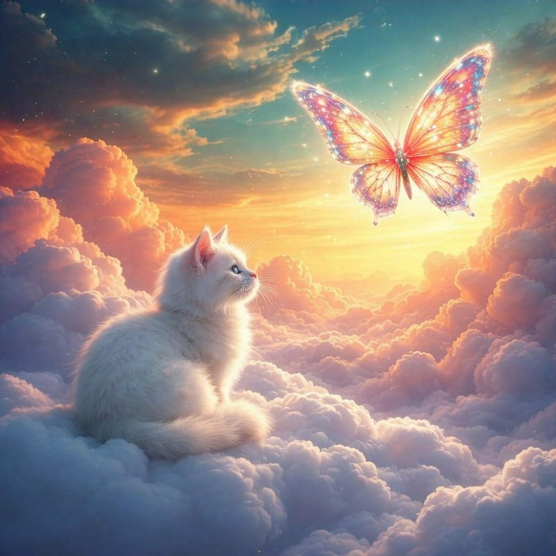
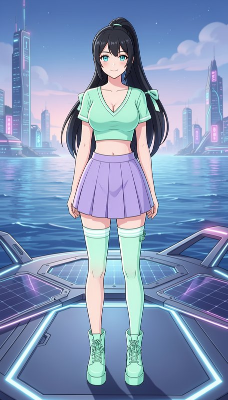
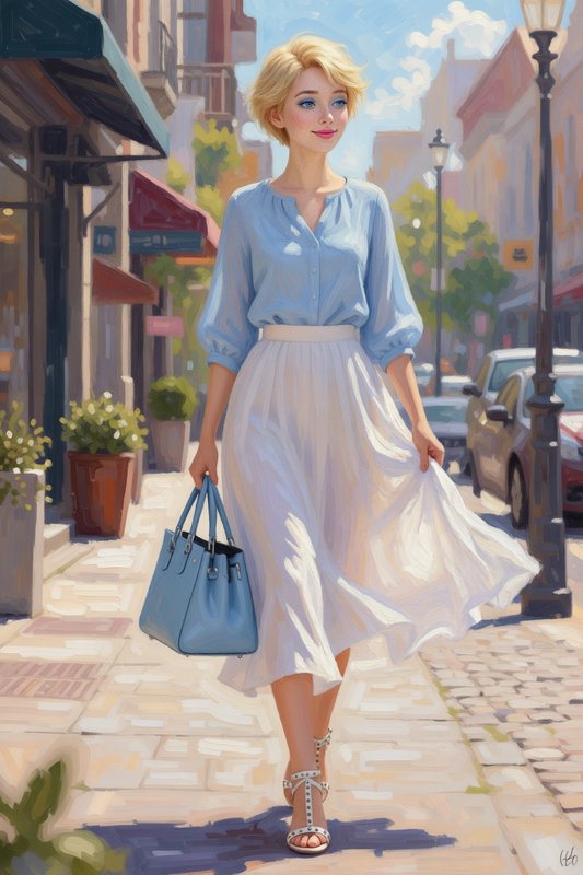
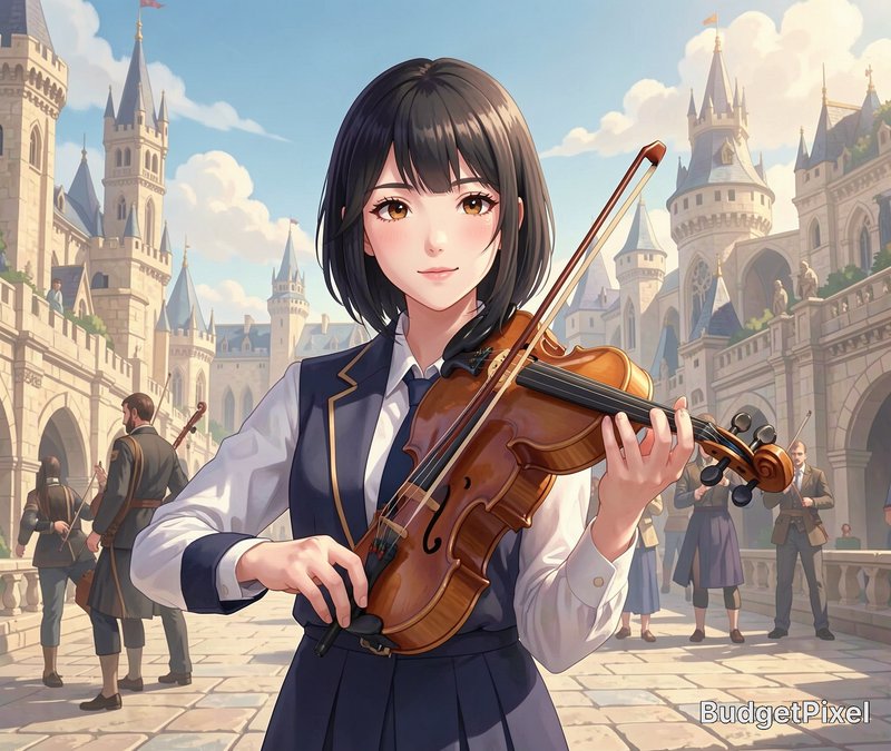
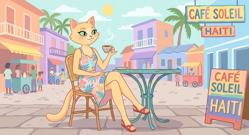
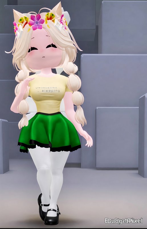
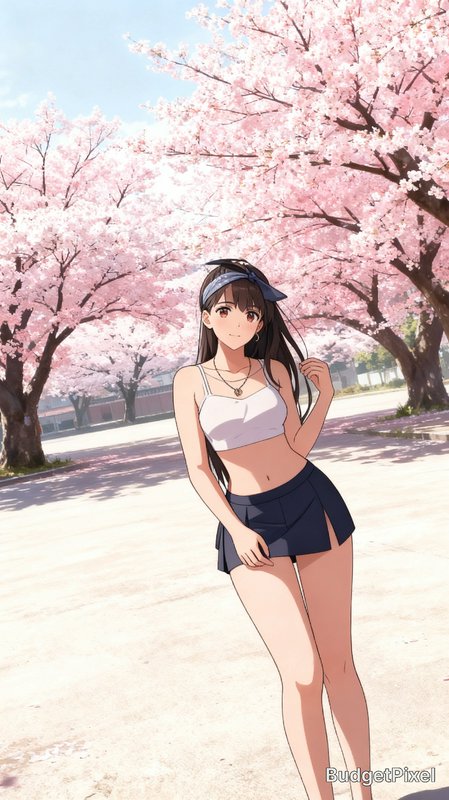
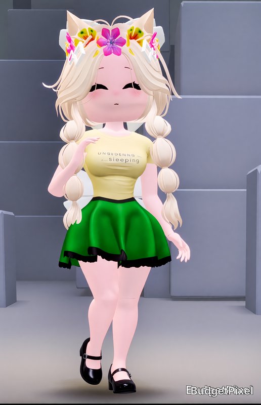
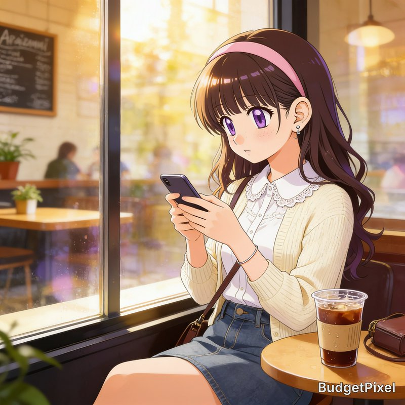
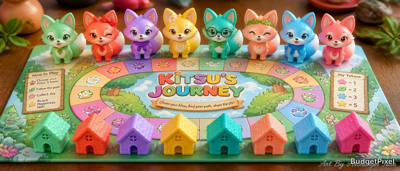
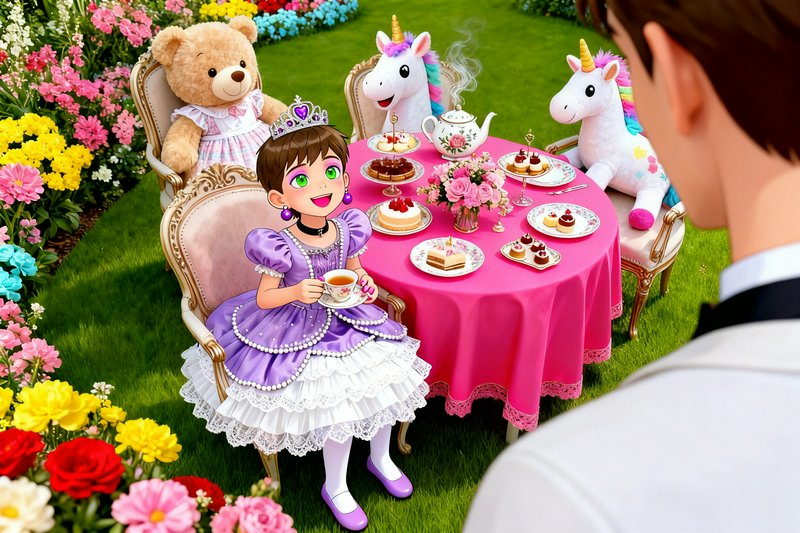
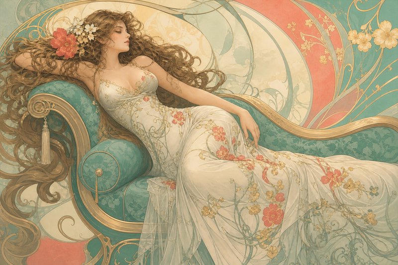
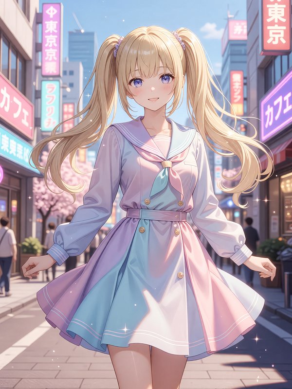
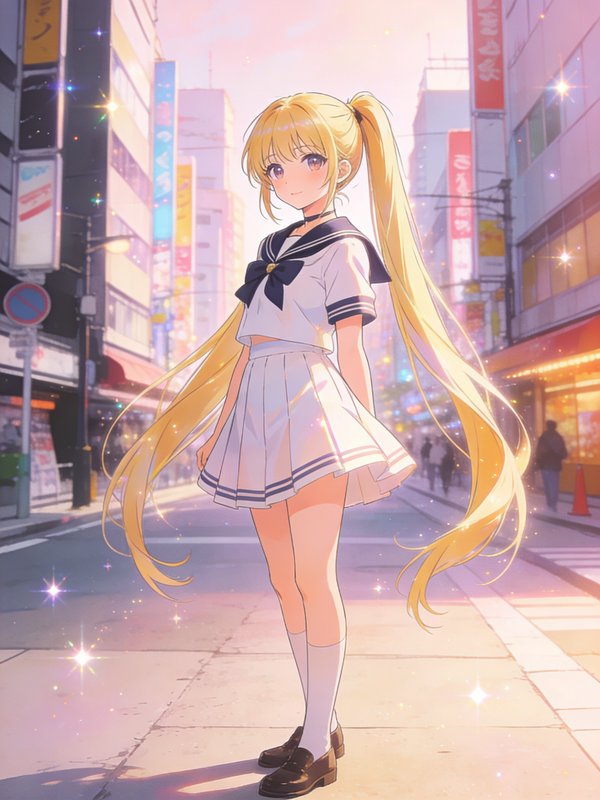
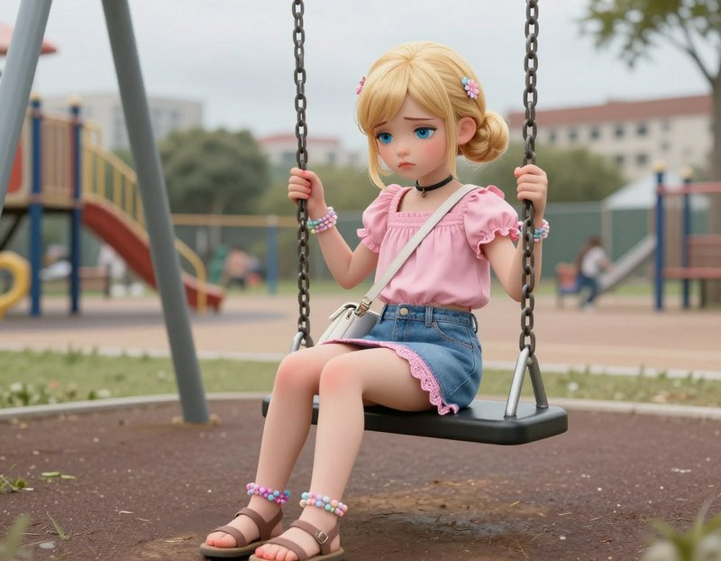
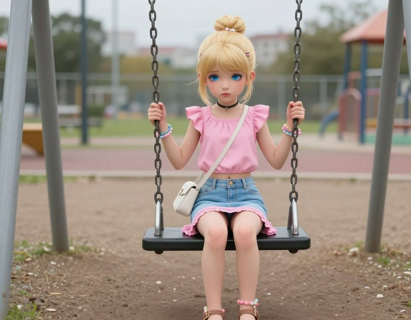
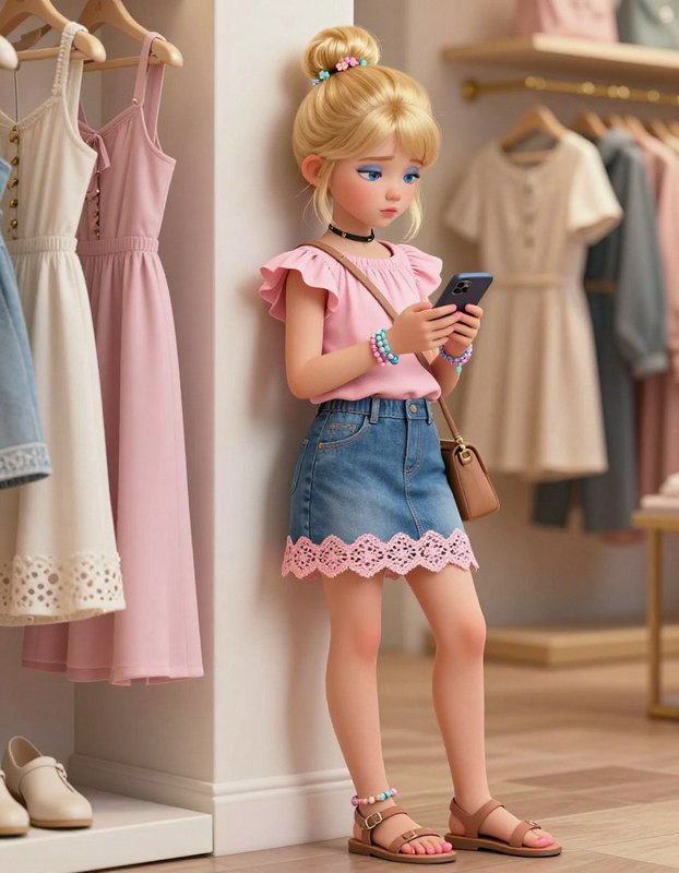
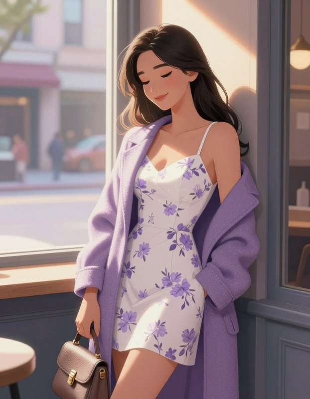
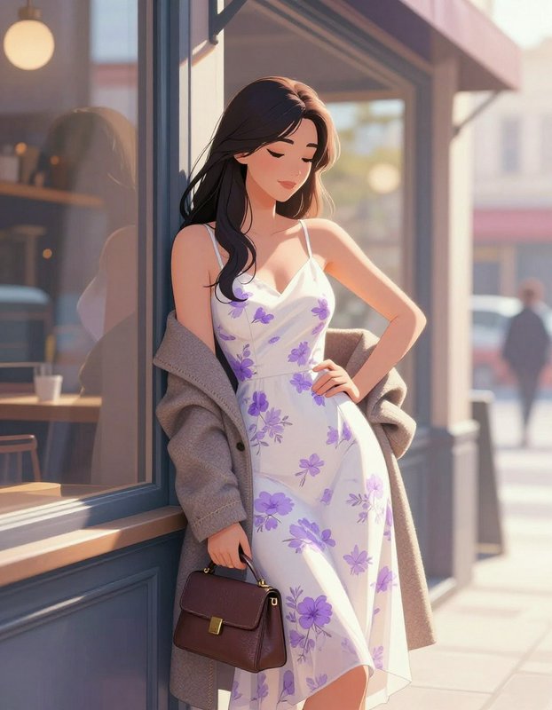
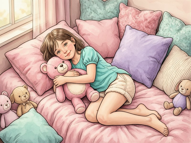
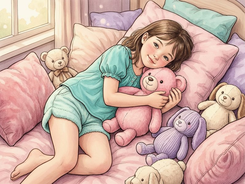
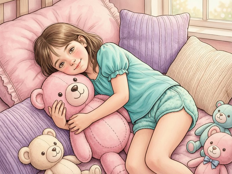
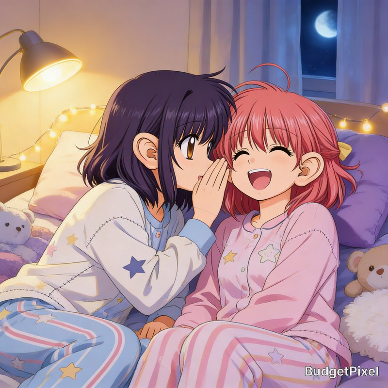
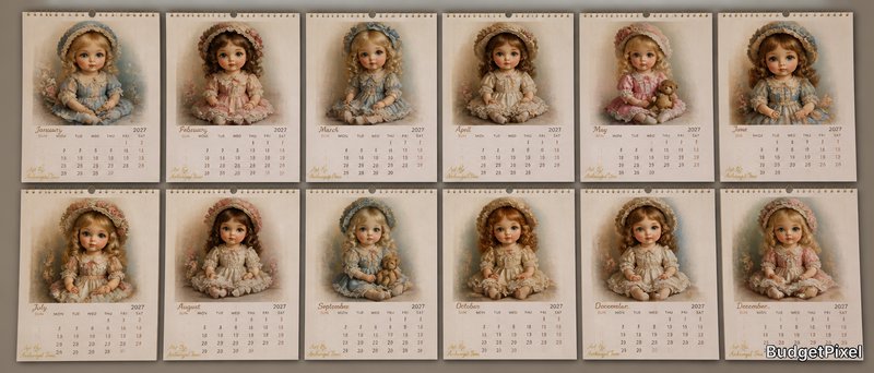
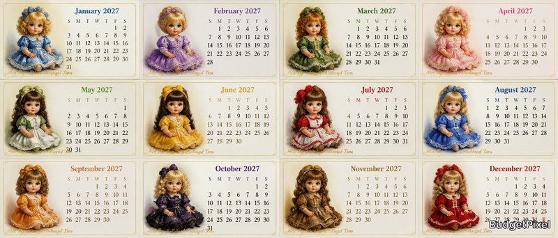
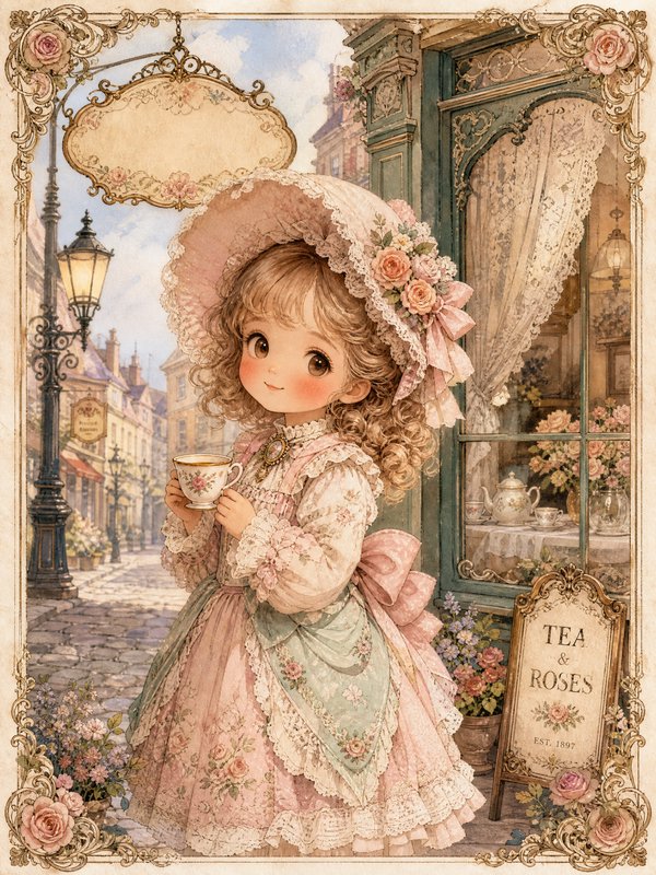
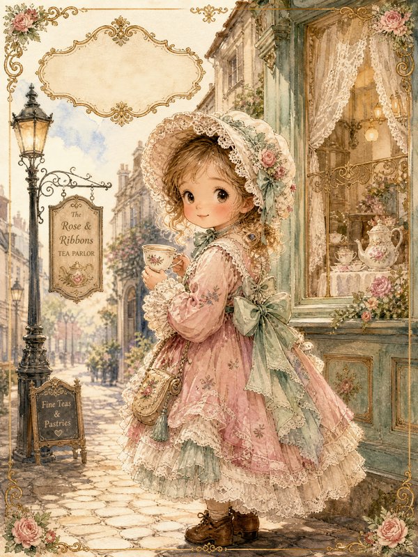
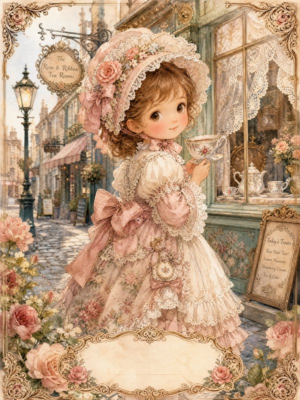
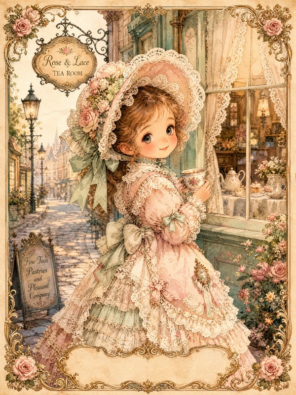
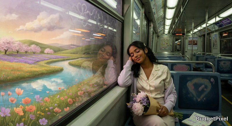
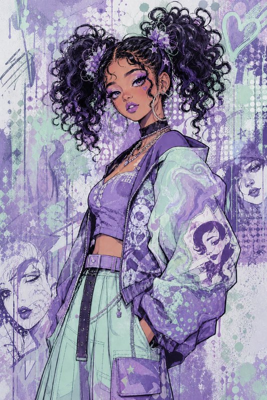
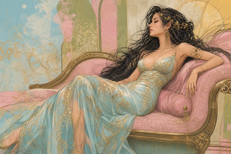
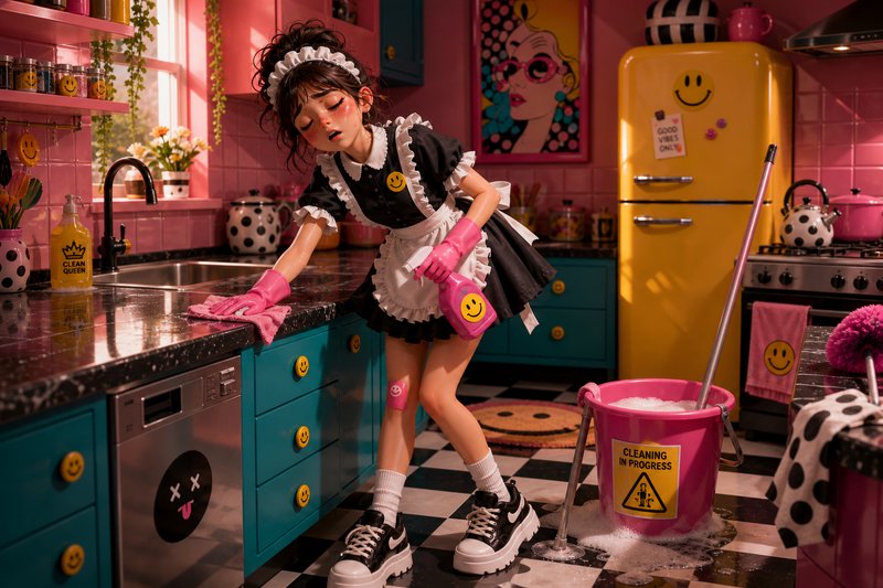
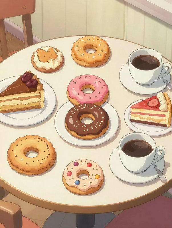
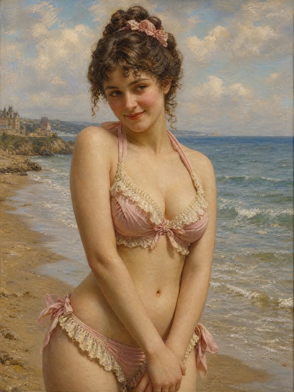
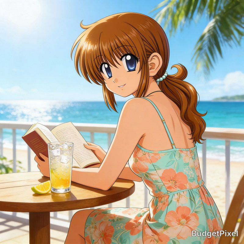
Soft, desaturated palettes — the whole frame pitched to a narrow, quiet range.
588 published by the BudgetPixel community
A pastel palette means high lightness and low saturation across the whole frame — colours mixed toward white so no hue dominates. The technical consequence is a compressed tonal range with no deep shadow, which is why pastel work reads as soft and airy and why it fails when a prompt also asks for contrast. Getting it right is mostly about what you leave out.
Make your own pastel colours image
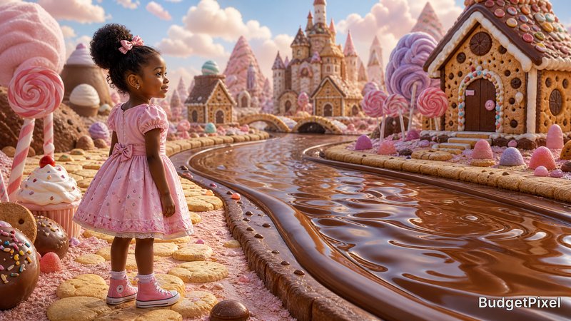
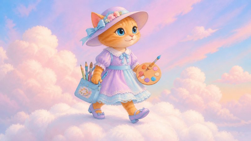
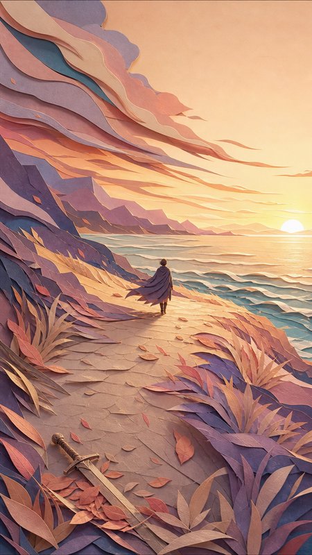
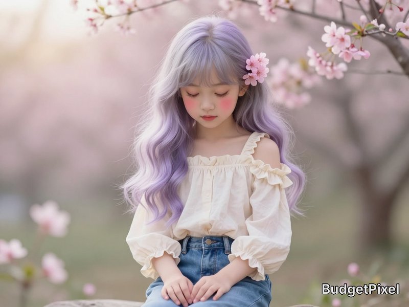
Everything in this grid was generated on BudgetPixel. Describe what you want and the same models will make it.
Start creatingMake your own pastel colours image
Everything in this grid was generated on BudgetPixel. Describe what you want and the same models will make it.
Start creating





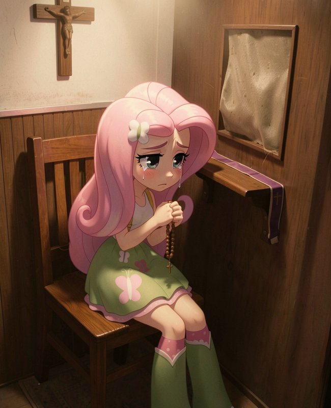
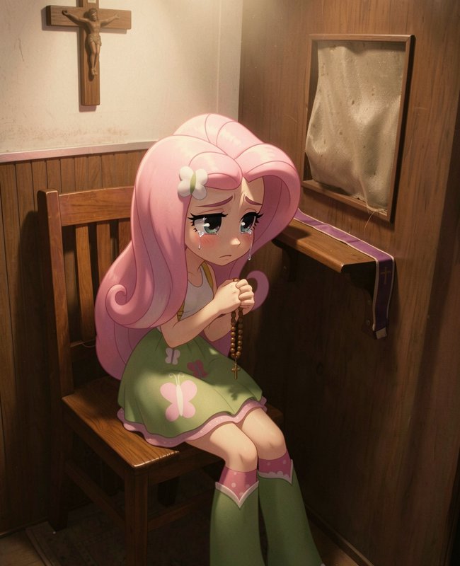
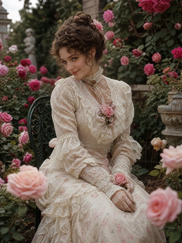
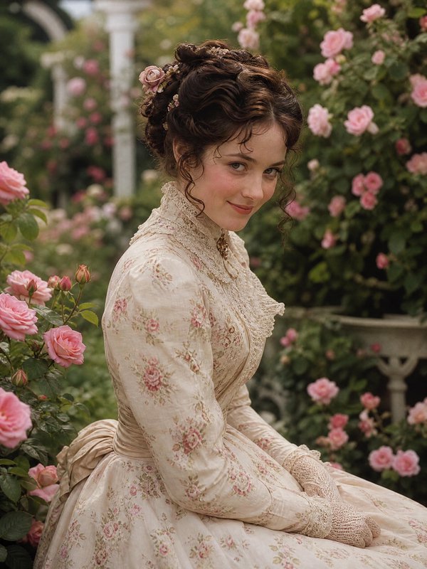
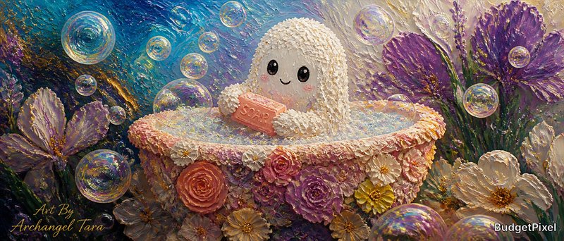
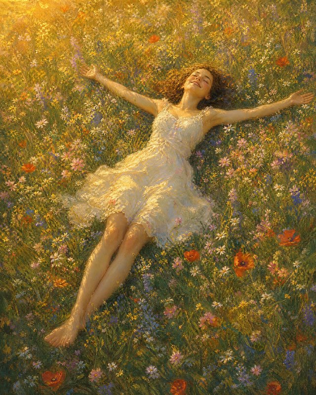
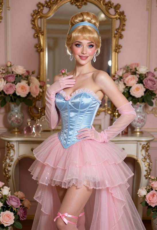
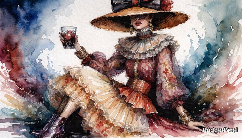





Pastel Colours prompts to start from
Working prompts, not fragments. Open one to load it into the generator, then change whatever you like.
- Still life of ceramics in powder blue, blush and pale butter, flat diffuse light, no deep shadow anywhereUse →
- Bedroom interior in high key, pale sage walls and cream linen, overcast daylight, soft uniform exposureUse →
- Portrait against a pale lilac backdrop, heavy fill, compressed tonal range, gentle low-saturation colourUse →
Pastel Colours AI images: common questions
How do I get a genuine pastel palette?
Ask for high-key light with no deep shadow, and name two or three specific pale colours rather than saying pastel. Powder blue, blush and pale butter gives a model something to work with; pastel on its own often produces saturated colours with a light haze over them.
Why do my pastel images still look saturated?
Because most prompt vocabulary pushes toward vivid colour, and a single strong word — sunset, neon, vibrant — will override a pastel instruction. Removing any competing colour language and specifying a flat, diffuse light source usually fixes it in one pass.
What lighting supports a pastel look?
Flat and diffuse: overcast daylight, a large soft source, or bounced light with heavy fill. Directional light creates dark shadow, and dark shadow is precisely what breaks a pastel palette — so this is one of the few cases where deliberately uninteresting light is the right answer.
Related topics
Make your own pastel colours images
Everything here was generated on BudgetPixel and published by the person who made it. The same models are available to you — pick one, write a prompt, and publish the result to the community feed if you want it here.