
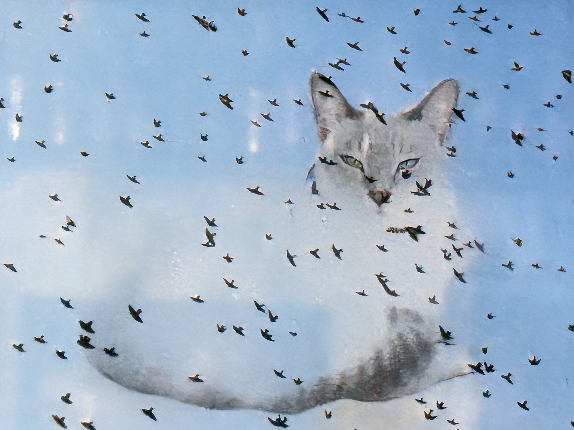
Surreal monochrome artwork of a faint cat face partially overlaid
By @Sealine ·
20 likes · 14 comments
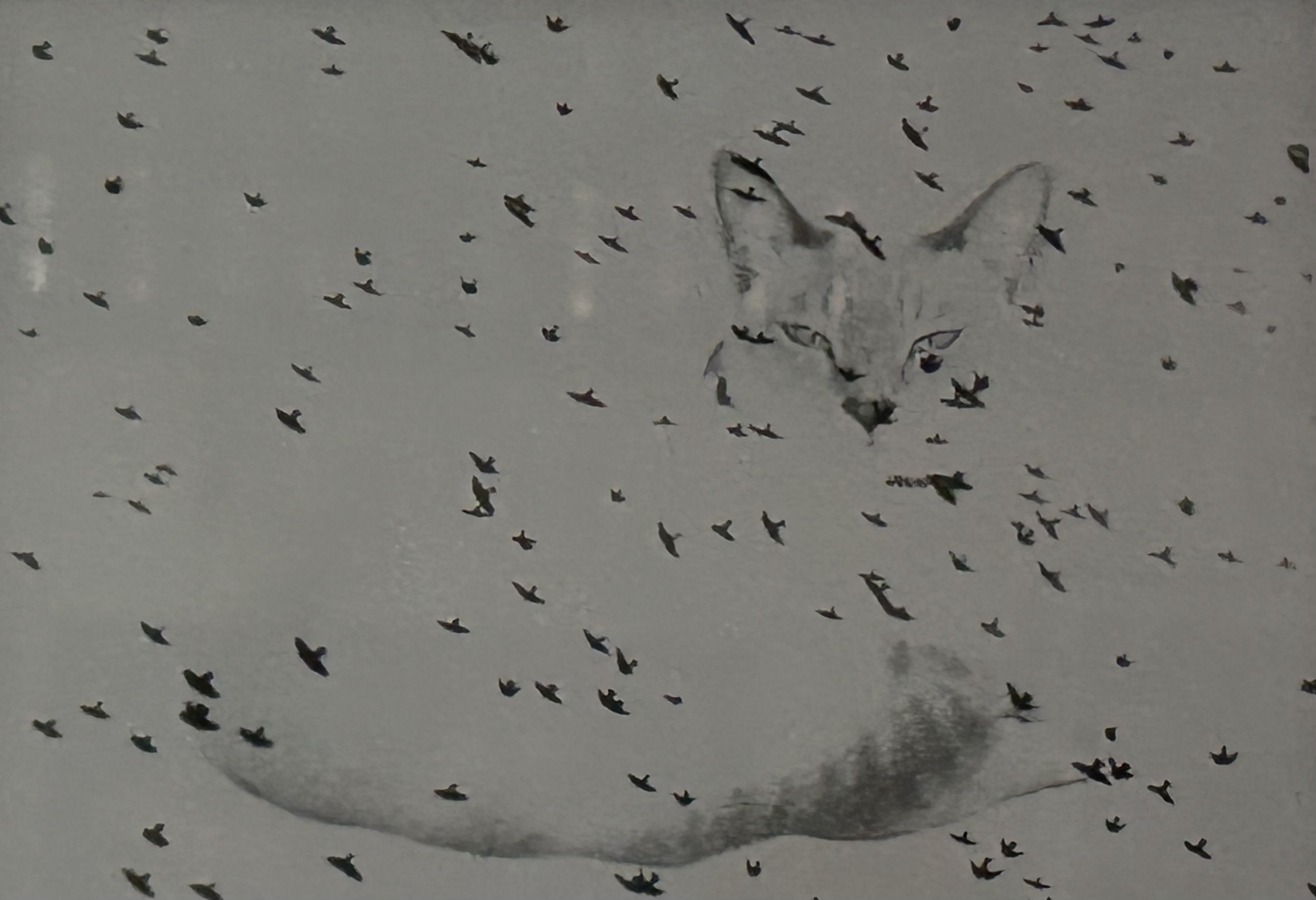
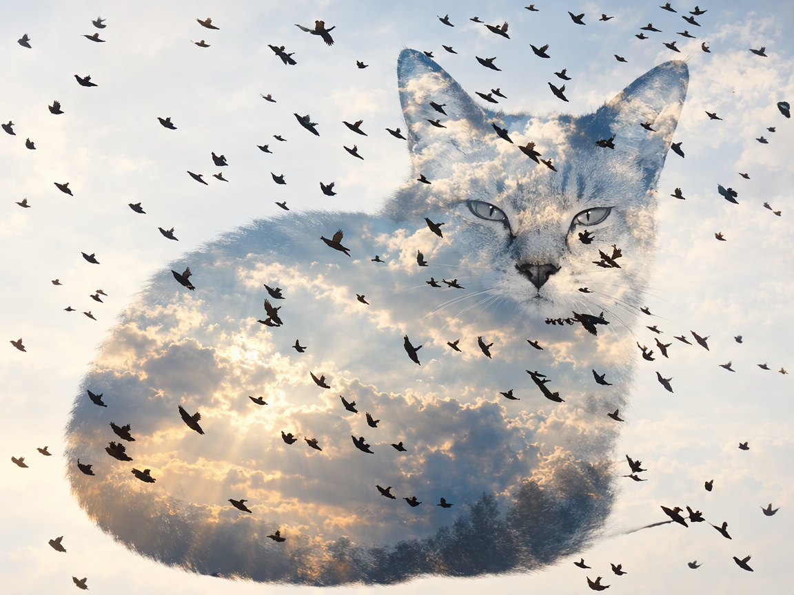
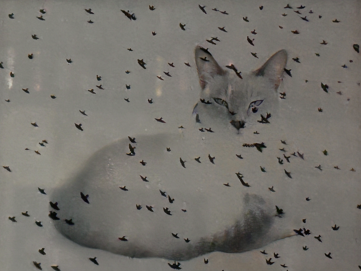
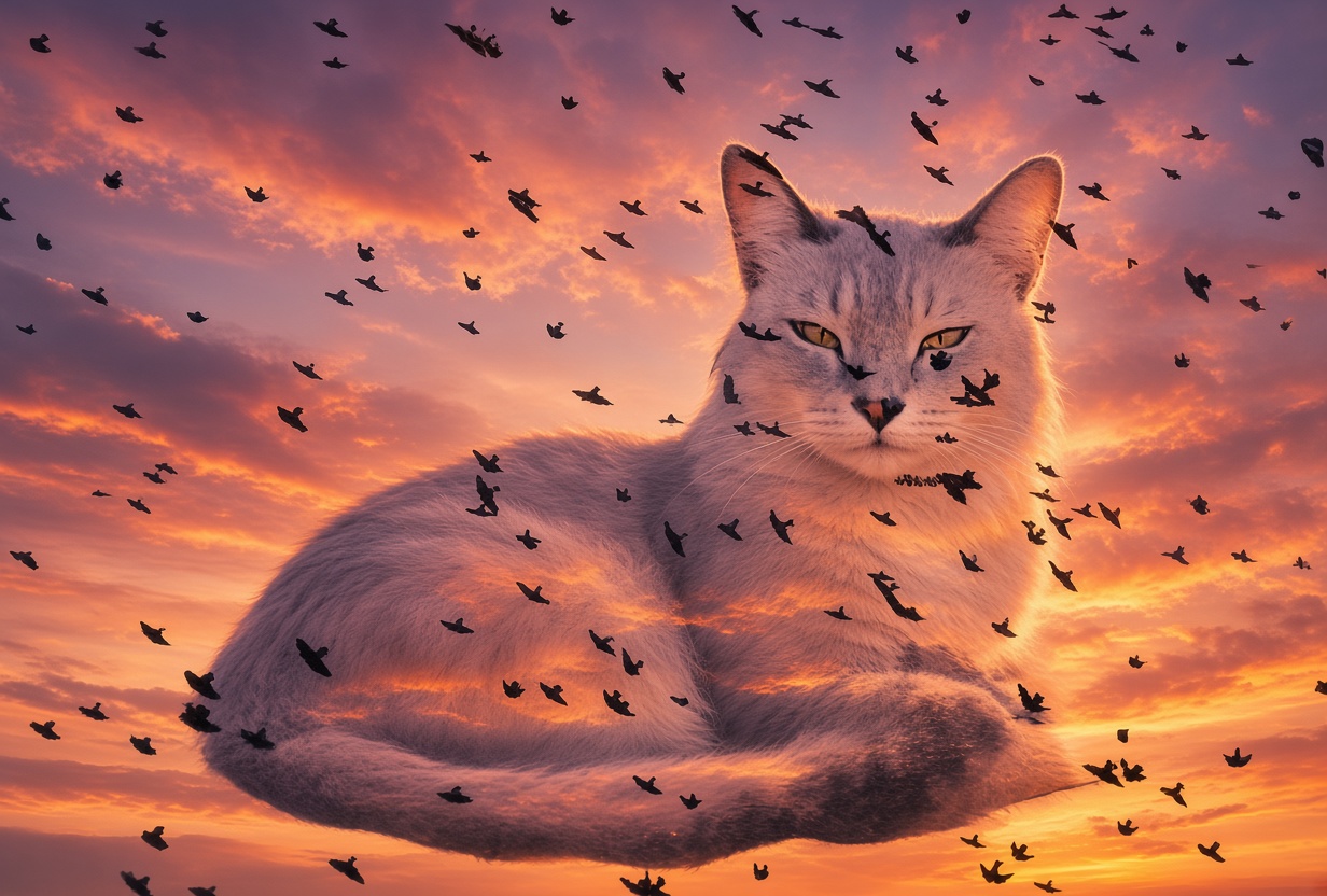
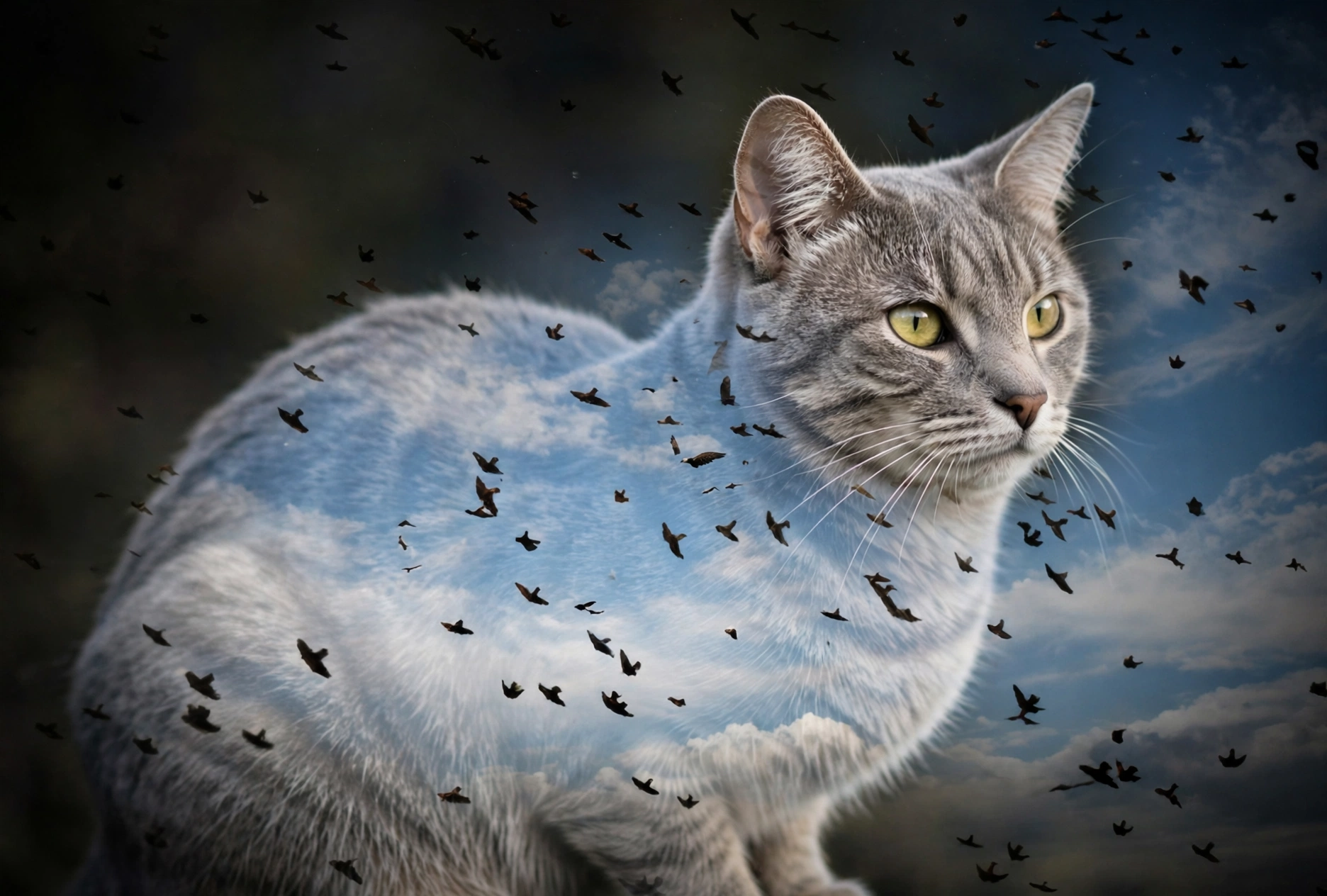
These were created using a photo of mine from a high school photography class. The technique was a “negative sandwich” using two negatives sandwiched together to create one image. My image ended up a little underexposed but it was a picture of my cat sandwiched with a sky full of birds (image one is photo of original photograph). I decided to let AI see if it could make my photograph better. I wasn’t impressed. Prompt: Use reference photo to take this old school negative sandwich image and create a modern day double exposure image of a cat overlayed with a sky full of birds.
Made with GPT Image 2.5 Sunburst
Make an image like thisEntry in the Your sketch/photo to create AI images theme.
Tags
- surreal art
- cat artwork
- flying bird silhouettes
- monochrome painting
- ethereal illustration
- starling flock
- whimsical art
- gray palette
- surrealism
- cat face
- wild birds
- dreamy art
- contemporary animal art
- surreal wildlife art
- surreal cat art
- double exposure
About this image
This ethereal surreal painting uses a soft muted gray palette to show a delicate translucent cat face peeking out from a swarm of tiny dark flying bird silhouettes. The atmospheric blended brushwork creates a dreamy, quiet mood, with the cat form half hidden among a flock of small wild birds. The gentle understated color scheme gives the piece a hauntingly poetic, calm tone.
This ethereal composite artwork uses double exposure to shape a calm, alert domestic cat out of soft golden hour clouds, pale blue sky, and distant treeline silhouettes. Dark flocks of flying bird silhouettes scatter across the frame, overlapping the translucent, dreamlike cat form. The palette blends warm peach and gold sunset tones with cool soft blue sky hues for a whimsical, peaceful mood.
This ethereal surrealist painting features a soft pale grey cat, its form half emerging from a matching muted grey background. Hundreds of tiny dark abstract bird shapes are scattered across the entire composition, creating a dreamlike, quiet haunting mood. The limited monochrome palette with only deep black accents gives the piece a soft, vintage fine art aesthetic.
Comments (14)
I loved that you shared a photo. Double exposures are hard in real cameras. I thought you did a solarization effect. I love #6 actually. It's a good double exposure, the way the vignetting on the left plays off the gray in the cat's fur. and that intent look is the look my cat gives when it spots a bird. The birds are very happy she has finally become an inside cat. some of the bird shapes didn't come out right but you don't really realize unless you look very very closely which most don't do. But even on the original some of those hsapes are as is so it's not the AI's fault. It was being pretty faithful actually.
@Sealine ·
Thank you! My photo was actually created in the dark room with the two separate photos I had. My photography class was really fun. Too bad I didn't keep up with it. I did like being able to develop my own film, though I'm not sure that even exists anymore!
@panos ·
You're wellcome! Only creative class I ever had was one year at junior high. Yes painted with watercolors. I loved it - but I sucked in it... 😄
@Sealine ·
Thank you! 💙 I'll have to dig out some other photos from that class.
@panos ·
I remeber reading about that technique somewhere. some of these turned out good
@Sealine ·
I was never good at art classes, but I enjoyed photography, drama and dance.
For black and white it does. I'm not so sure about color. B&W has a certain cachet. Galleries are more likely to feature a photographer who does B&W. -- I did a sandwich assignment too. I was really young, in my 20s. I took a picture of myself leaning against a mirror so I was doubled. The second picture was a poem on white paper. That was probably cheating I didn't really have to half the exposure time exactly for the poem/paper neg. It came out pretty cool but I didn't realize until I had a good exposed and developed copy that I had made a typo in the poem. I didn't redo it but I still liked it. ---Now we can type directly on photos so it would be easy to make that same one. ---I agree with you. It was really fun. But the reality is also it's not great to pour those chemicals down the drain. So it's a mixed bag. It's also very important to have a darkroom with great ventilation. I loved seeing the images emerge in the developing tray tho.
Sign in to join the conversation.
More from @Sealine
See all → Dark-skinned fantasy noblewoman with an elaborate celestial hat reclines on an ornate gilded blue velvet chaise
 Glowing golden-eyed black cat stands foreground as a lunar witch leads a coven ritual in a domed gothic temple
 Four whimsical Halloween fairies gather to decorate a giant spooky themed birthday cake in a candlelit magical kitchen
 Gothic vampire sorceress with a baby dragon, black cat, and ghost stands in a moonlit Halloween graveyard
 Frankenstein's monster and his bride dance at a festive Halloween graveyard party under a glowing full moon
 Frankenstein's monster and his bride share an intimate embrace in a stormy gothic Halloween graveyard
More like this
See all →

Made on BudgetPixel
The models and tools behind posts like this one.