
A mix of many different backgrounds, which is best?
 @breljoset
For each Budgetpixel challenge I often find myself asking which one should I pick?
Sometimes I find the one I like right away but certain details are off, so I take that image and put it back in the machine to give me more variants. Here are some of the results I got, I'm curious which ones you like best, please let me know!
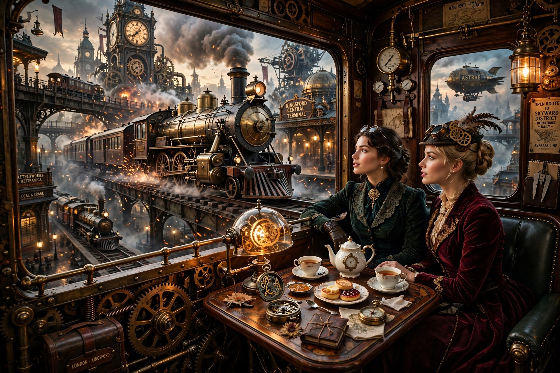
#1.
This is the original, however the obvious details are off. Train cars usually don't have windows between cars them and only on the sides. Also, the two other locomotives barreling in the direction of this passenger car isn't too plausible of a track layout.
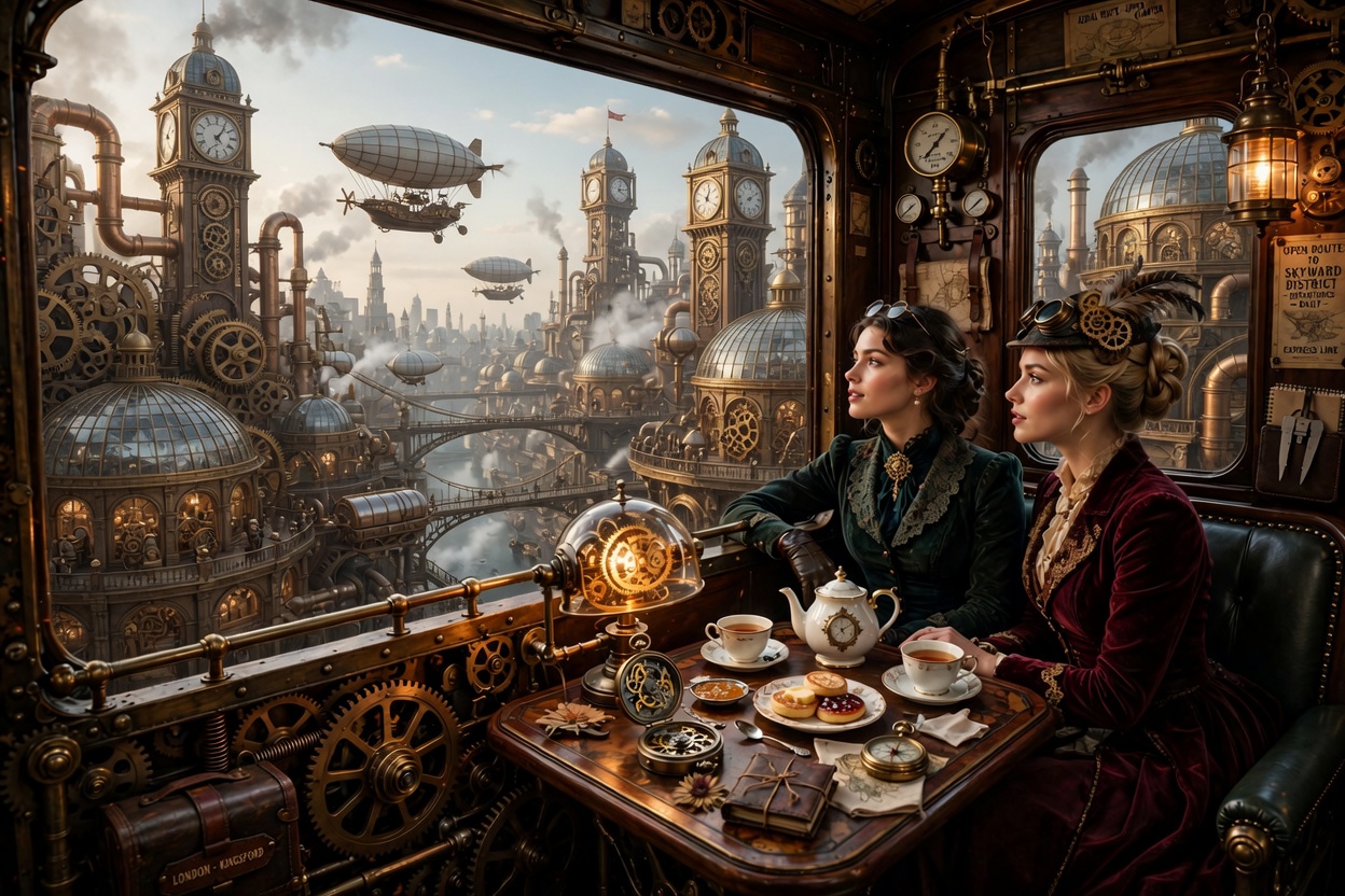
#2
I received this as a result with Grok Imagine, the pair are overlooking a common steampunk city while riding their steampunk train. The problem: steampunk as a style is cool but it can also be ugly at the same time. I decided on changing up the setting. (Also I borked it by keeping the rear window!)
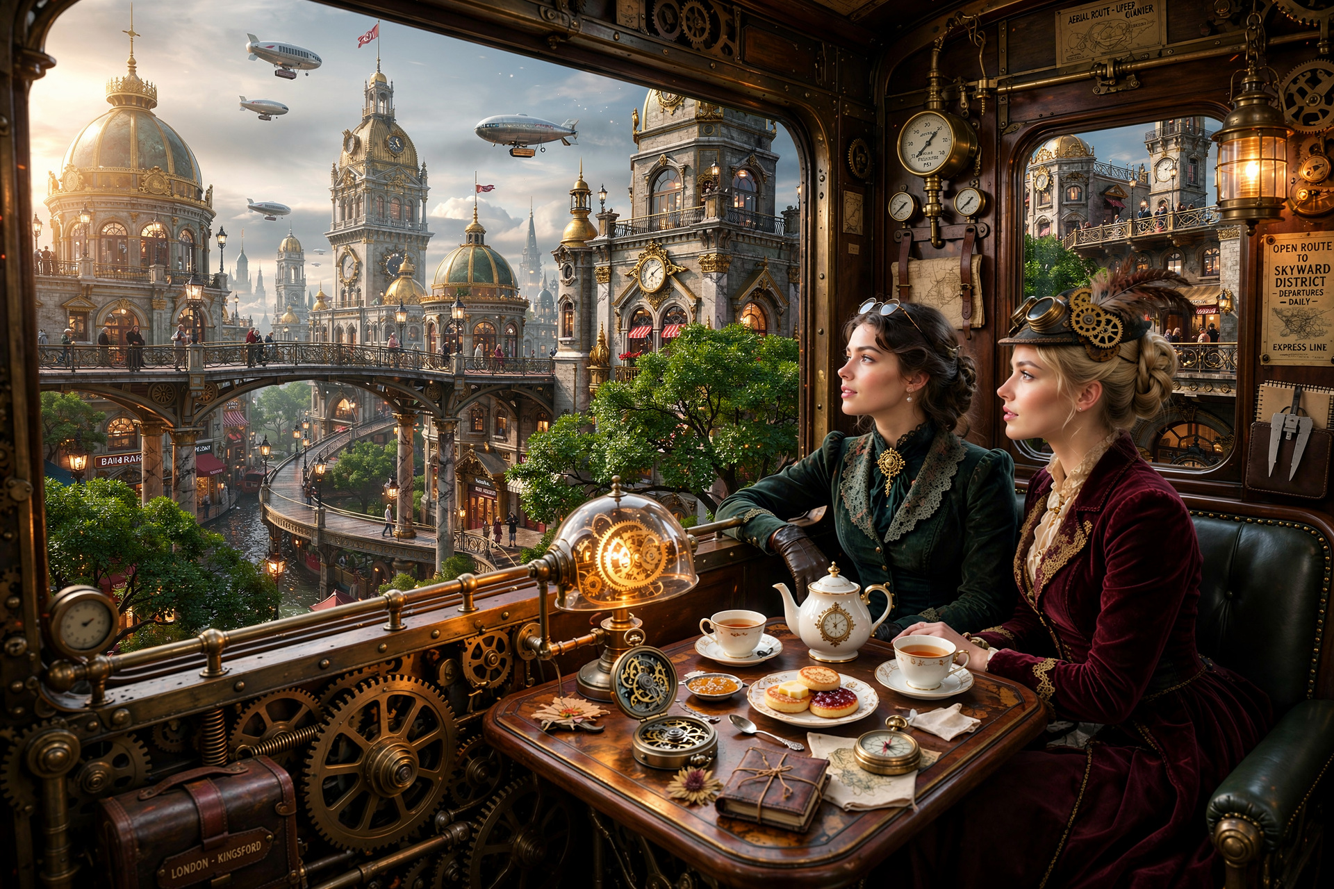
#3
This one is a more scenic result, with a beautiful and lively city with some lush greens. Generated with Flux-2.
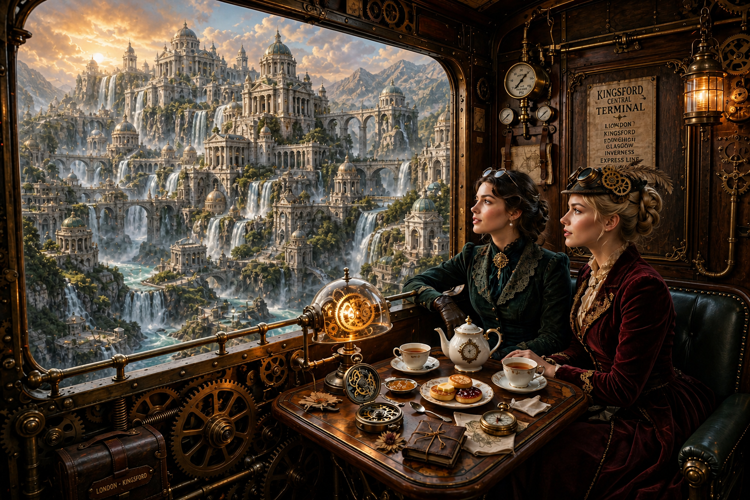
#4
This time I took care of the rear window. The scenery in this image was generated with gpt-image-2, though I feel the way GPT 2 generates their images doesn't match with the rest of the aesthetic of the image but I felt it was important to show the result.
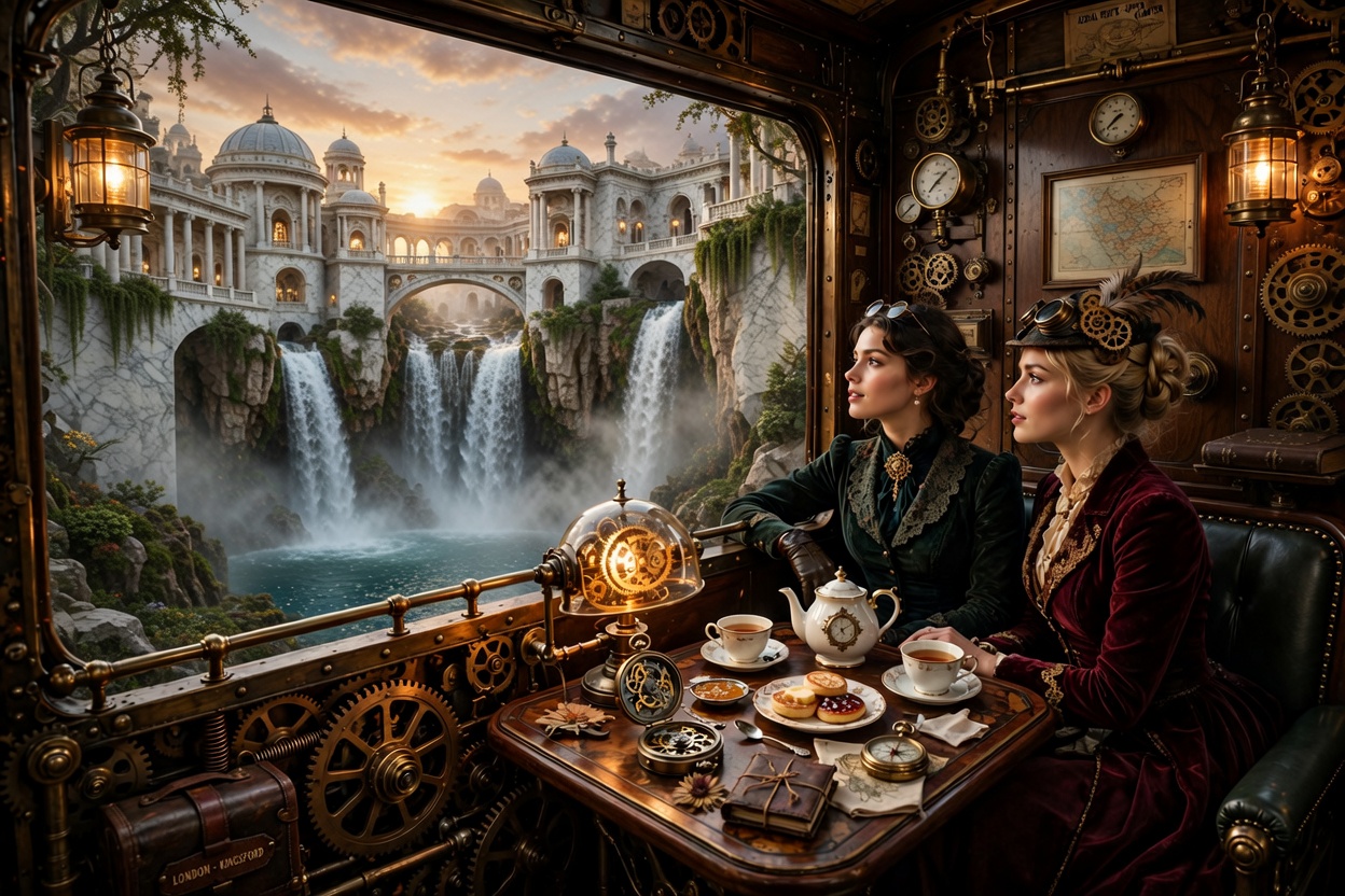
#5
Here was another stunning result, this one by Grok Imagine. I'm sorry that sometimes I don't spread out and try many other models but I do love the quality of GPT and Grok quite a bit, and often fall back on them far too much!
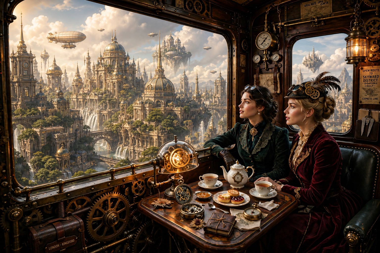
#6
And here was another result created with GPT-image-2 medium, which churned out some surprisingly good quality. I liked the scenery so much I decided to go with that. But there were still issues I felt needing ironing out which was done in the final and last slide in this blog.
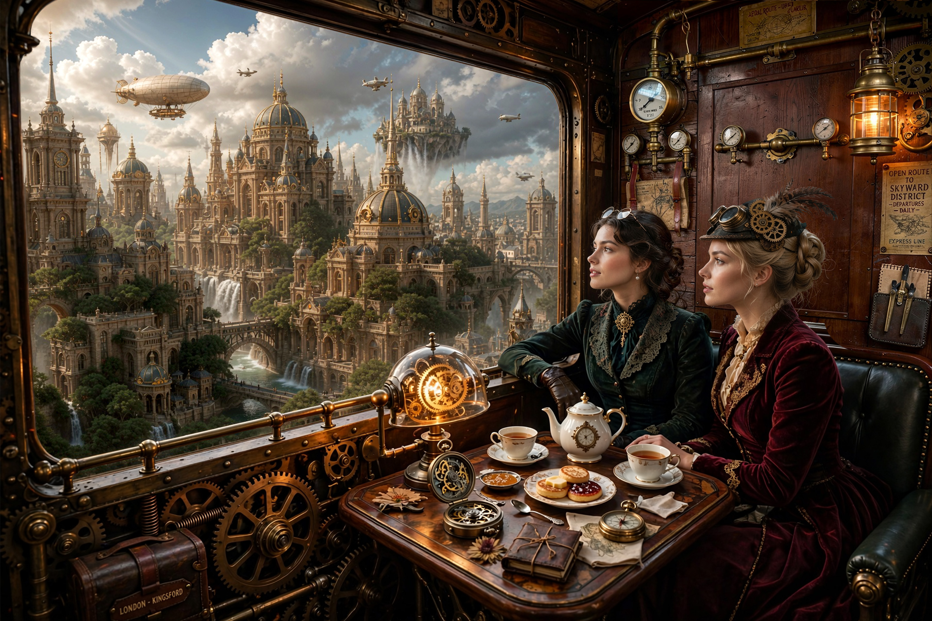
#7
The final result which I submitted for the challenge.
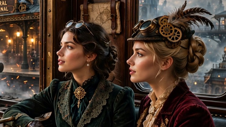
I selected the character's faces and asked Grok to give them more detail when zoomed in and also to give the scenery in the window slightly more realistic coloration and detailing. I eventually merged all of these components into a single image and after a few other color tweaks was satisfied with the result.
Hope you enjoyed reading this blog and if you have a particular version you liked, let me know! Thanks!
Topics
 @monkeydude69
 @EternaSky

 @DavidP
 @Sealine
 @southamericanmyth
 @germancowboy
Comments (10)
I like that idea, would be good for an animation
Not sure if this is an unpopular opinion, but I actually like the original the best. The intent of creating a visual of a high tea in a steampunk train looking out, while certainly realistic and plausible, will still lean towards fanatsy and make-believe anyway. So to me the steampunk city with the train will integrate better with the setting, despite being not possible. This is similar to how audiences throw certain logic away when seeing a show (termed as "Suspense of disbelief"). That said, whichever background works is really up to the individual's preference.
Thanks for sharing @breljoset I would certainly pick the images with out the window between the compartments/carriages. I liked the more steampunk city views best. Not withstanding the perhaps unrealistic trains in the first, I liked its vividness. And given it is art, I would not have worried about the two extra trains.
Thanks, it was fun making these, I was making different variations right up until the challenge stopped letting me switch images so I thought I'd post a few versions and see what people liked.
You're right, the cohesiveness of the style goes a long way, aside from the two other trains it was for the most part a good image. Thanks for the comment!
Sign in to read all 10 comments and add yours.