
Retro-Futurism AI images
The future as an earlier era imagined it — chrome, fins, atomic optimism.
2,108 published by the BudgetPixel community
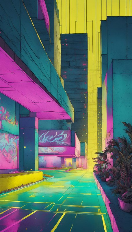
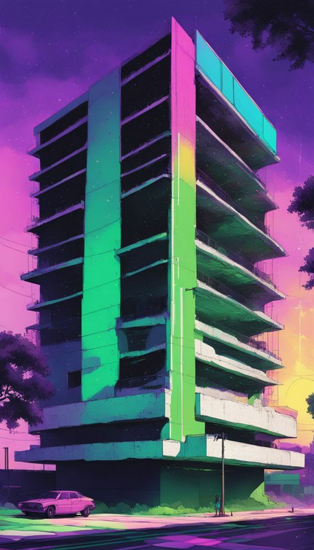
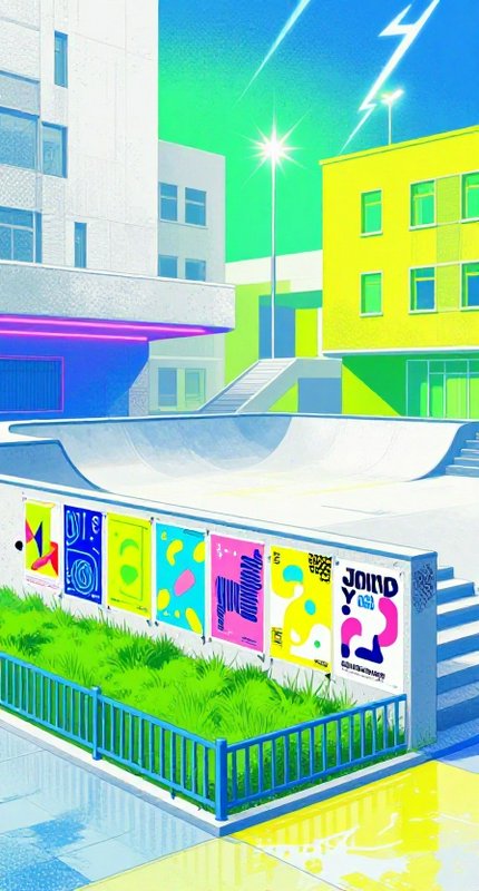
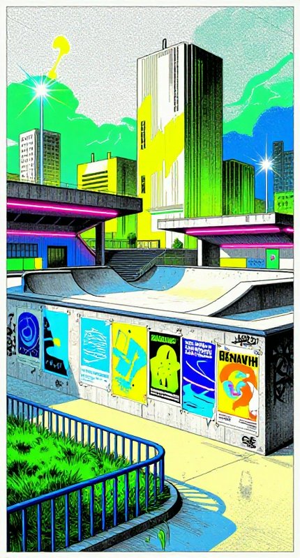
Retro-futurism depicts the future as an earlier era imagined it — chrome and fins, atomic optimism, rounded mid-century forms, and space travel styled like commercial aviation. The tone is the point: these are futures that never arrived, so the images carry period graphic design and colour alongside technology that is advanced but shaped by the aesthetics of its own decade rather than ours.
One image on this page is published under a Creative Commons licence — free to use and adapt, including commercially, if you credit the creator. Look for the licence badge on a tile, or open it to see the exact credit line. How licensing works
Make your own retro-futurism image
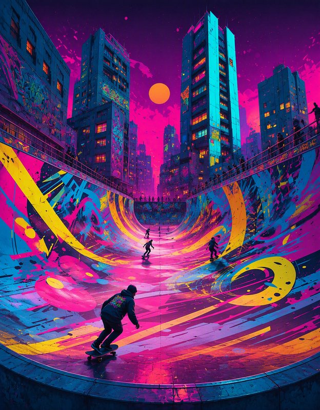
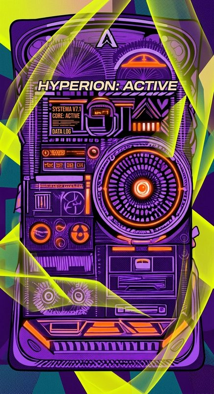
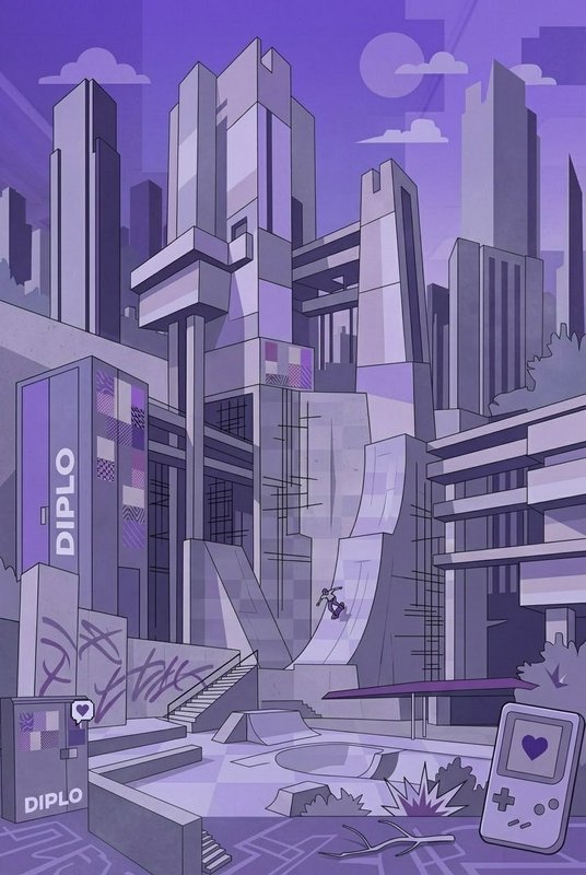
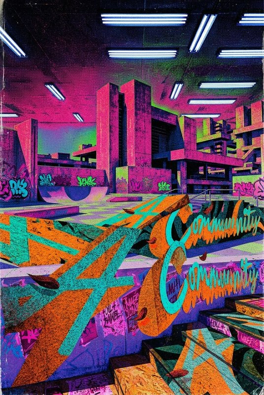
Everything in this grid was generated on BudgetPixel. Describe what you want and the same models will make it.
Start creatingMake your own retro-futurism image
Everything in this grid was generated on BudgetPixel. Describe what you want and the same models will make it.
Start creating
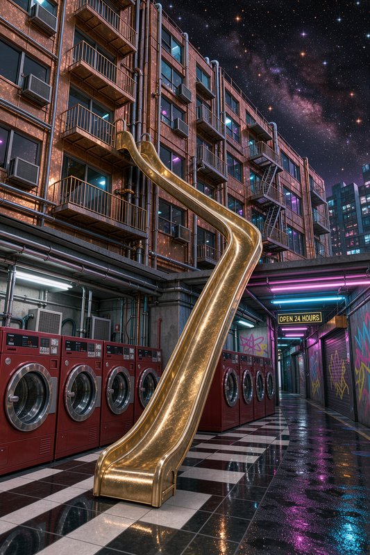
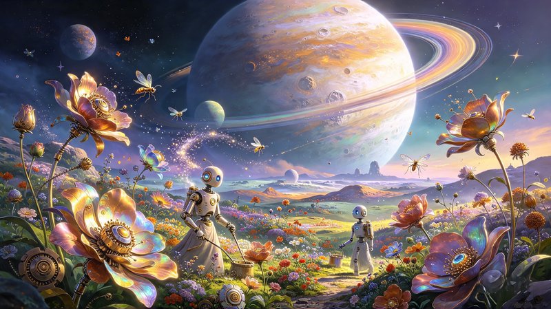
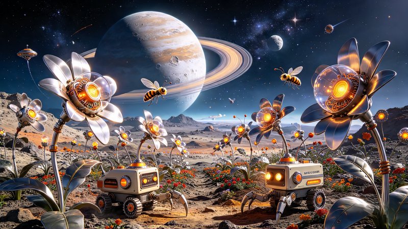
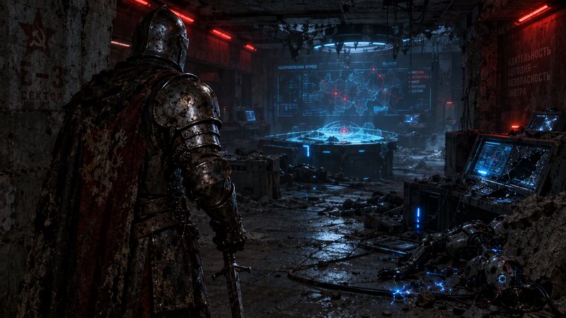
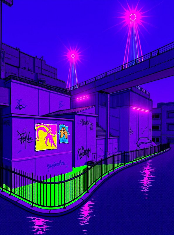
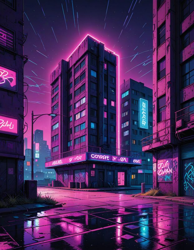
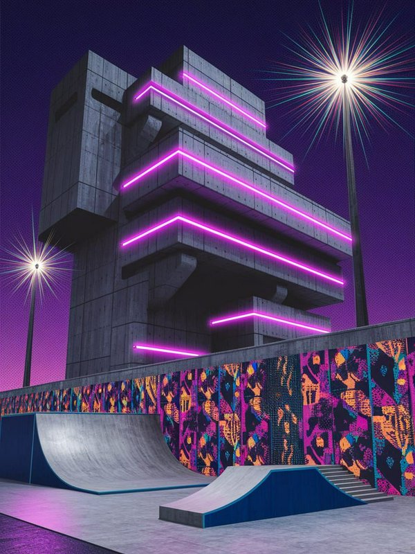
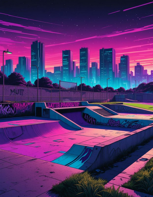
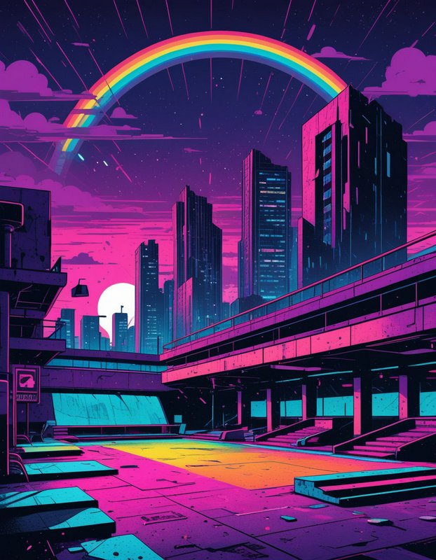
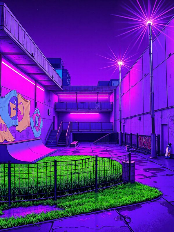
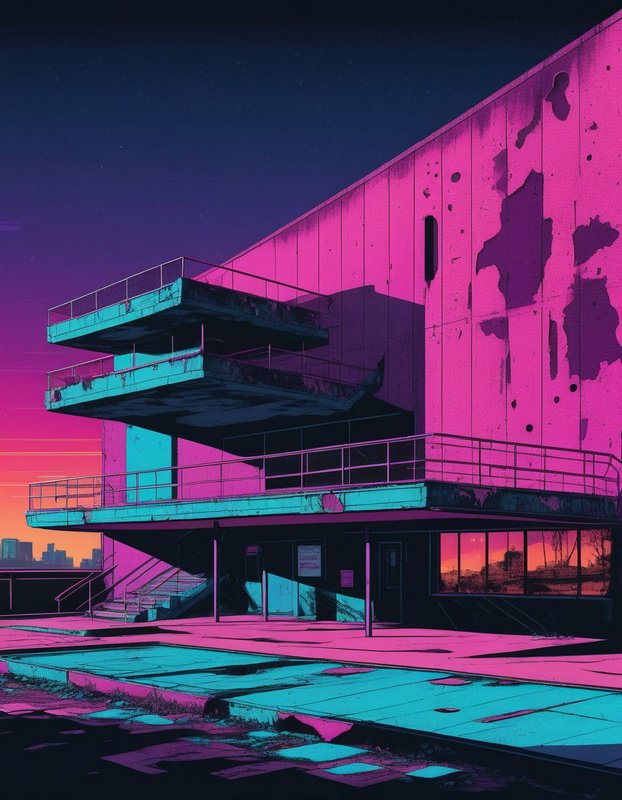
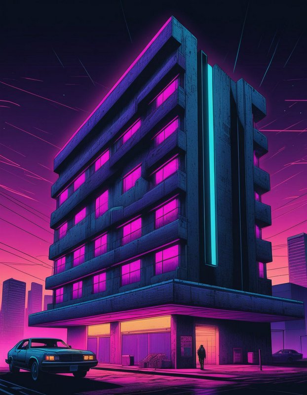
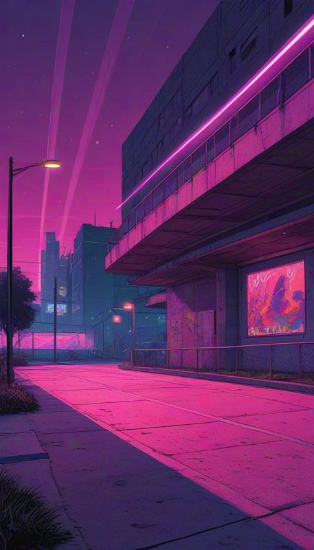
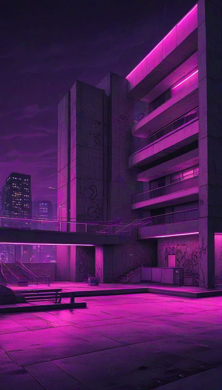
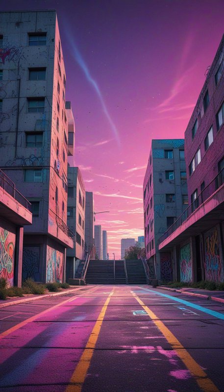
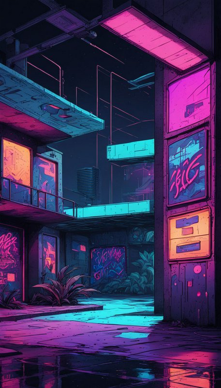
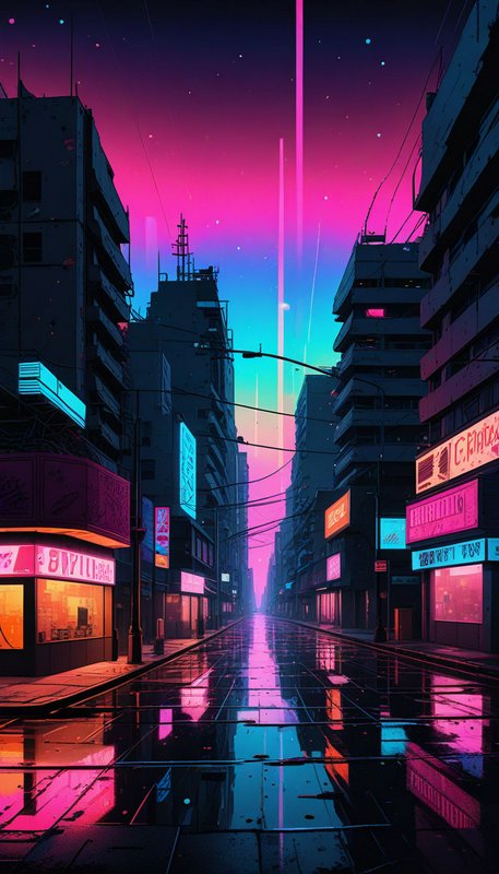
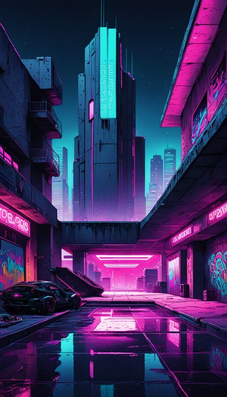
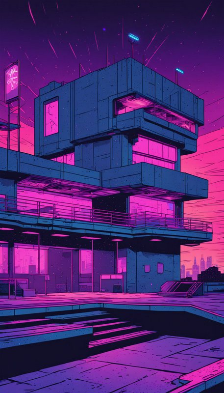
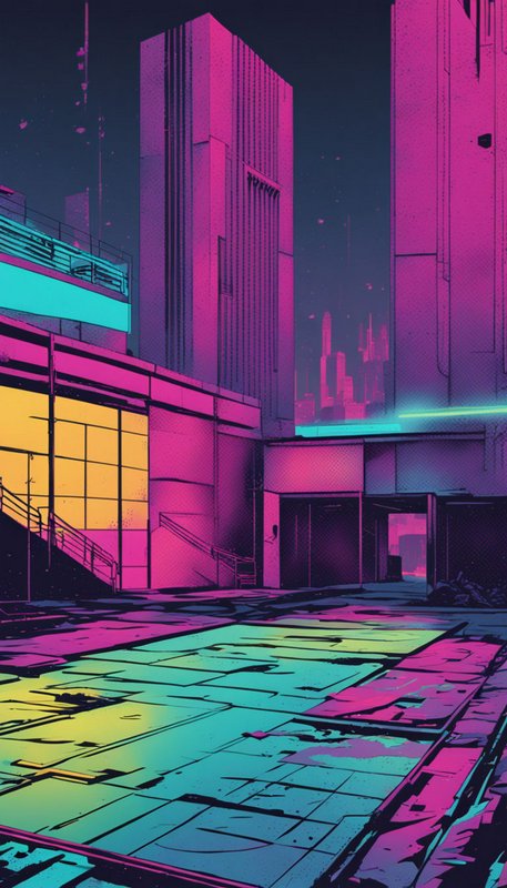
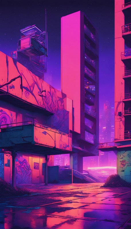
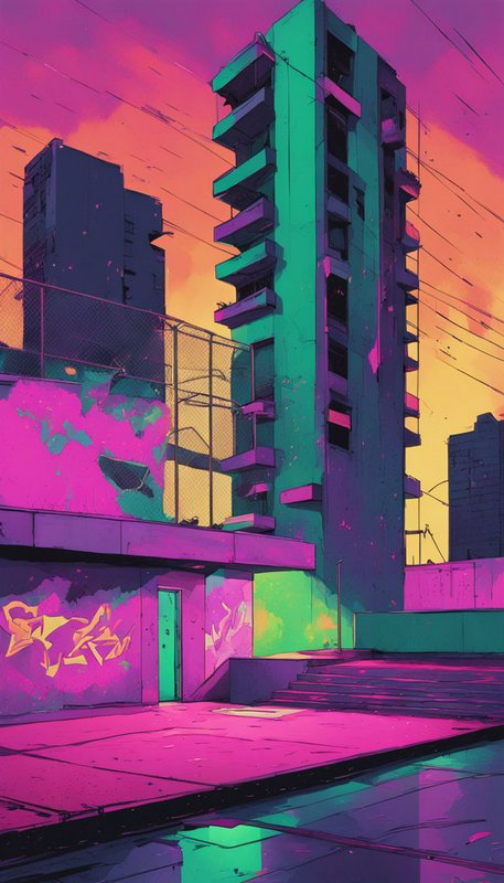
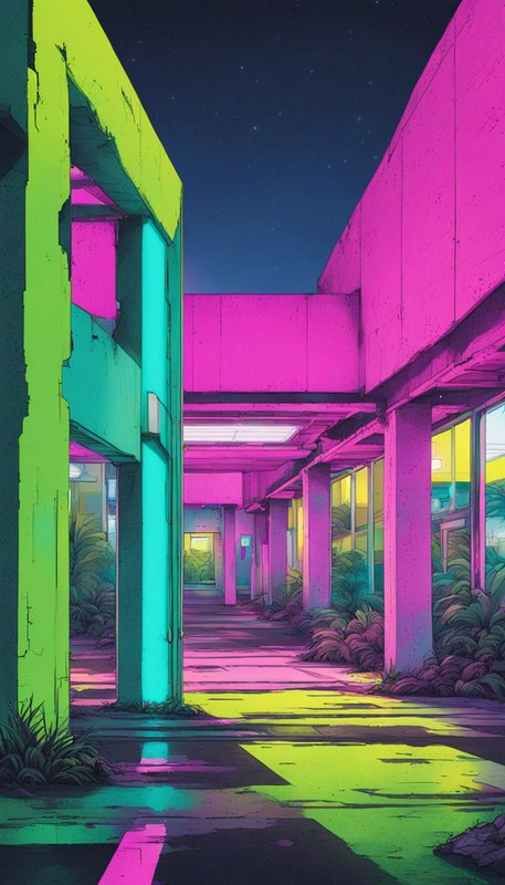
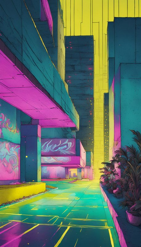
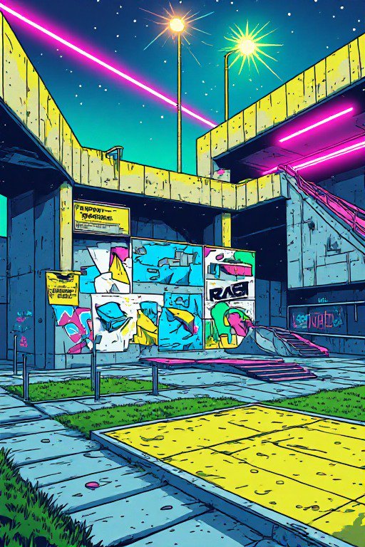
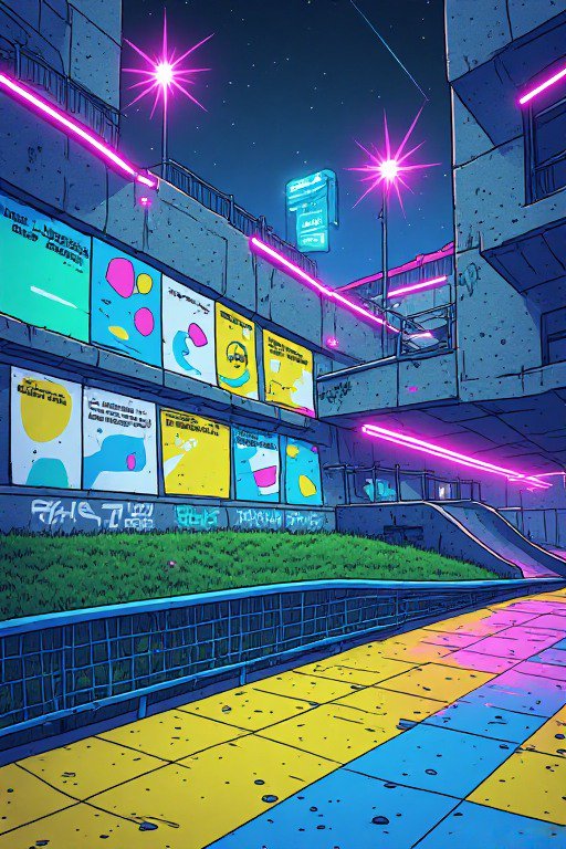
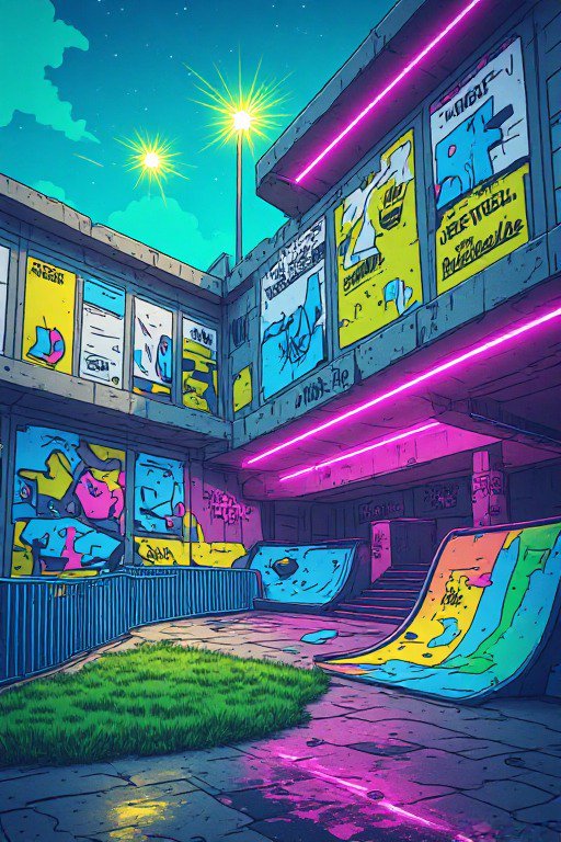
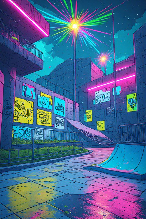
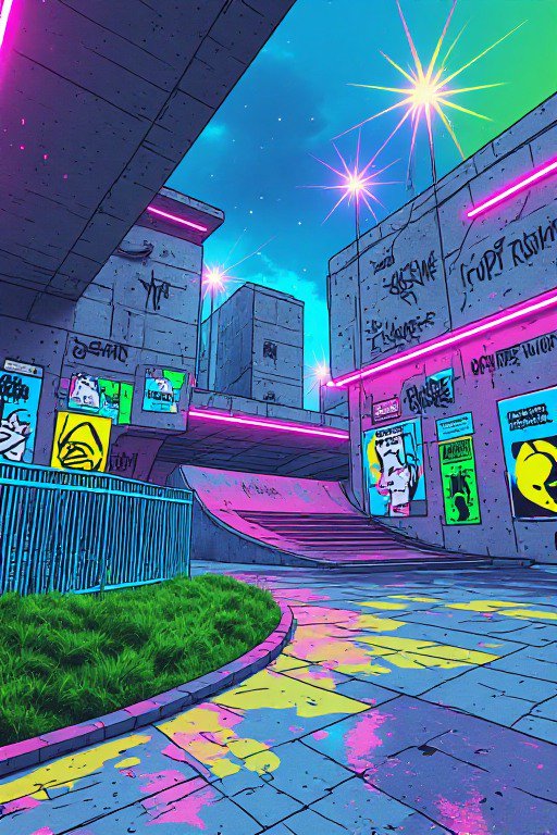
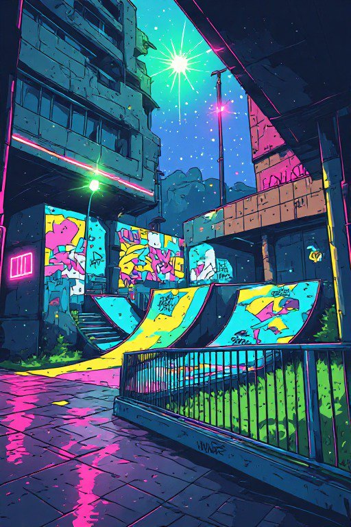
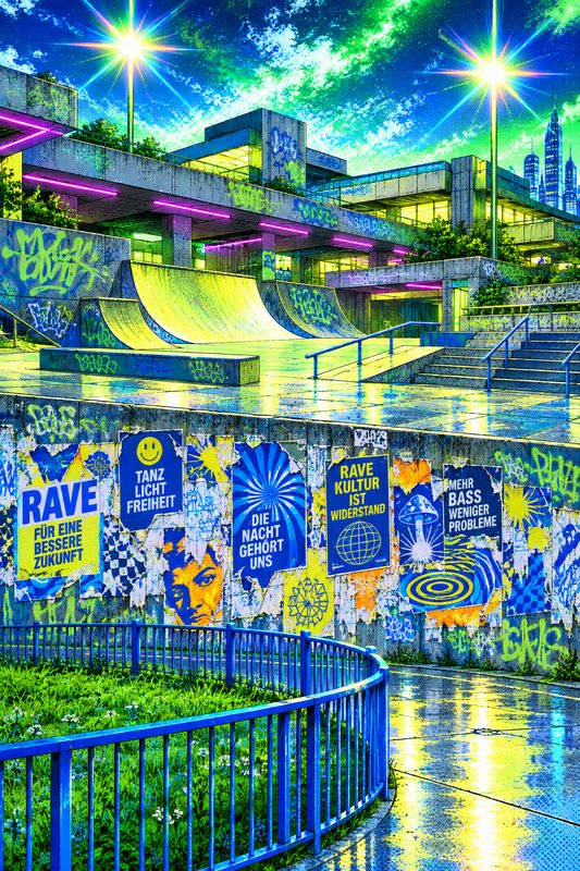
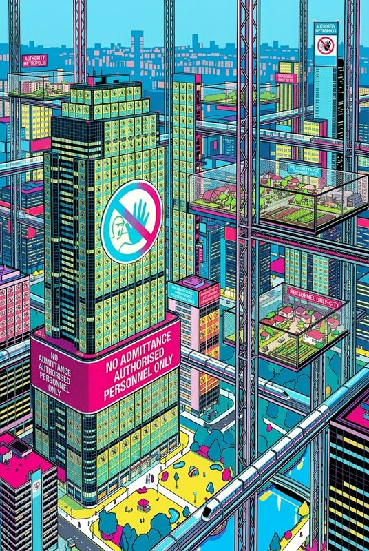
Retro-Futurism prompts to start from
Working prompts, not fragments. Open one to load it into the generator, then change whatever you like.
- Atomic-age family at a rooftop spaceport, chrome and fins, teal and coral palette, gouache magazine illustrationUse →
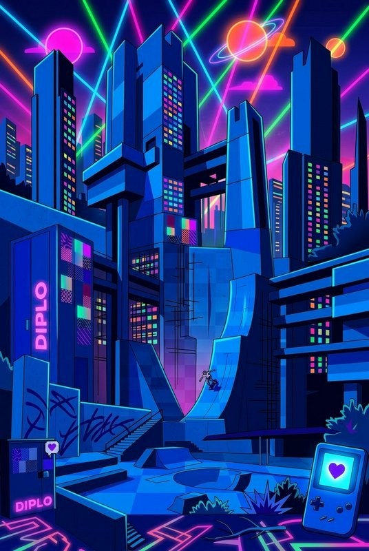
- 1980s future: wireframe grid horizon, airbrush gradient sky, neon sun, chrome letteringUse →
- Mid-century domestic robot serving breakfast, rounded forms, starburst motifs, flat colour advertising artUse →
Retro-Futurism AI images: common questions
How do I get a retro-futurist look rather than generic sci-fi?
Pick the decade doing the imagining. A 1950s future has chrome, fins and atomic motifs; a 1980s future has wireframe grids, airbrush gradients and neon. Saying retro-futuristic alone averages across all of them, which produces something that belongs to no period at all.
What does atomic-age design look like?
Rounded organic forms, boomerang and starburst motifs, teal and coral and butter yellow, chrome trim, and technology styled like domestic appliances. Naming those elements directly is far more effective than naming the era, because they are shapes and colours rather than a date.
How do I make it feel period-authentic?
Match the illustration technique to the era. Mid-century futures were painted for magazine covers and advertisements, so asking for gouache illustration with flat colour and hand-lettered type gives a far more convincing result than a modern photorealistic render of the same subject.
Related topics
Make your own retro-futurism images
Everything here was generated on BudgetPixel and published by the person who made it. The same models are available to you — pick one, write a prompt, and publish the result to the community feed if you want it here.