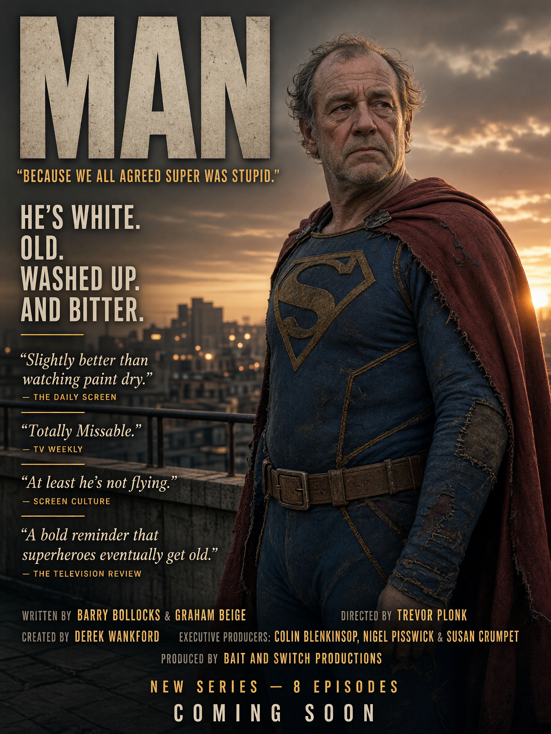
Satirical "MAN" parody poster featuring an elderly — AI art by @monkeydude69
@monkeydude69 · 8/25/2026
Entry in the FRONT COVER MAGAZINE theme on BudgetPixel.
From the Team that gave us "Lanterns"
Tags: parody poster, superman parody, old superman, satirical tv poster, comedy series art, aging superhero, retired superhero, funny fake movie poster, superhero satire, mock tv poster, worn superhero costume, dc parody, deadpan comedy, fictional series poster, rooftop sunset poster
AI Model: Grok Imagine 2.0
Prompt: Create a **photorealistic premium television promotional poster** for a brutally sarcastic British superhero comedy/drama titled: # **MAN** ### **“Because we all agreed Super was stupid.”** The protagonist is an unmistakable parody of an ageing Superman-type superhero, now in his early 60s. He is white, visibly old, slightly weathered, receding grey hair, tired eyes, stubble, and mildly out of shape, but still imposing. His expression says **“I've been doing this for 40 years and I genuinely cannot be bothered anymore.”** He wears an original, grounded superhero costume inspired by classic flying superheroes but **not an exact Superman costume**: faded blue fabric, worn red cape, practical boots, subtle repairs and signs of decades of use. He stands on a realistic city rooftop at sunset, looking completely serious and heroic despite being obviously past his prime. The cinematography must look like a **genuine expensive prestige TV drama**. The comedy comes from the dead-serious presentation and absurdly insulting marketing. ## Main typography Huge cinematic title: **MAN** Tagline immediately underneath: **“Because we all agreed Super was stupid.”** A large, clean marketing graphic should read: **HE'S WHITE. OLD. WASHED UP. AND BITTER.** ## Deliberately ridiculous creative credits Include highly realistic professional television credits, but give the writers and director **obviously stupid parody names**: **Written by Barry Bollocks & Graham Beige** **Directed by Trevor Plonk** **Created by Derek Wankford** **Executive Producers: Colin Blenkinsop, Nigel Pisswick & Susan Crumpet** **Produced by BAIT AND SWITCH PRODUCTIONS** The names should be typeset exactly like legitimate prestige-TV credits, making the joke initially subtle. ## Fake magazine reviews Include several realistic-looking fictional publication quotes: **“Slightly better than watching paint dry.”** — *The Daily Screen* **“Totally Missable.”** — *TV Weekly* **“At least he's not flying.”** — *Screen Culture* **“A bold reminder that superheroes eventually get old.”** — *The Television Review* Make the reviews look like genuine promotional pull-quotes, with tiny publication names, professional typography and believable editorial styling. Add: **NEW SERIES — 8 EPISODES** **COMING SOON** ## Visual direction Photorealistic, expensive Hollywood/streaming-service key art, cinematic 35mm photography, anamorphic lens, subtle film grain, realistic skin pores and ageing, sophisticated dramatic lighting, muted premium colour grading, detailed modern city skyline, natural fabric textures, believable costume construction, restrained visual effects. The protagonist should **not** look goofy. He should look genuinely heroic, exhausted and bitter. The entire poster should feel like a **serious prestige superhero drama whose marketing department has quietly decided to destroy the show's reputation**. No cartoon aesthetic, no cheesy comic-book graphics, no speech bubbles, no exaggerated slapstick, no Superman logo, no exact Superman costume. **Perfect professional poster composition, crisp typography, realistic film credits, clear readable text, dark British deadpan humour, absurdly serious presentation.**
Comments
JMN
damnit, is it that bad? I was hoping Lanterns was going to help out that part of the franchise after the Reynolds version.